I’ve spent the last few days working on the data pipeline I first mentioned in The Cloud Lottery that is Scottish satellite imagery. This pipeline consists of a series of R scripts that will place an order for Landsat 8 surface reflectance data and vegetation indices from the United States Geological Service, download the products as they become available then strip out the layers I’m interested in analysing, removing any areas of cloud or high atmospheric aerosols as they go. The hope is I’ll be able to leave this running and build a continuously updated dataset covering areas of interest that I can then query for data analysis purposes.
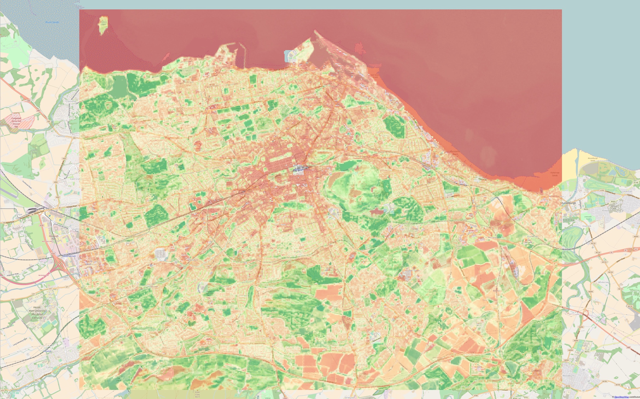
The Open Street Map of Edinburgh with Enhanced Vegetation Index (EVI) overlay. A particularly clear day on 25th October of 2016
When working on a job like this it is easy to get buried in the detail and lose sight of the end goal. As it is Friday afternoon and next week I need to turn my attention to other projects for a while I thought I’d visualise one of the clearer images and check I’m still on course. The images are fascinating so I wanted to share them.
You may have seen a recent article in the Guardian “How green is your city? UK’s top 10 mapped and ranked”. Edinburgh came out top with 49% “green”. These maps were produced by ESRI based on Normalised Difference Vegetation Index and are very simplified in comparison with what I hope to do. I’d recommend taking a look at that article as I don’t think I can reproduce the images here for copyright reasons. (I also think Edinburgh cheats a bit in the ranking by including a chunk of the Pentland Hills within its boundary which one wouldn’t do in a serious analysis!).

Close up of EVI for the botanics and surrounding area. Note how bright green the playing fields are compared to the botanics. Also note the mosaic of gardens and buildings.
Landsat 8 data has a resolution of 30m. Each pixel is about 100 foot across. I’m hoping that at this resolution we’ll be able to produce a proxy metric for how green and area “feels” to people living and working there especially when using Google Street View analysis to paint a fuller picture. It is not going to be simple. As you can see large blocks of green represent the biodiversity deserts that are playing fields. I’d also consider these aesthetic deserts. The mosaics of different greens seen in the botanics, the allotments, Warriston Cemetery and St Marks Park tell a different story as do the built up areas of the new town. I’m excited to see where we can take this analysis.