Part 1: The Very Basics
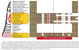
The backbone cladogram was created as a simple tree file in MacClade, exported to FigTree, then final manipulations done in Illustrator, including the addition of part of the original datamatrix alignment which was exported as a jpg from Geneious
The analyses are finally over, you can fill in those blanks in the results section, and really start dealing with all those hypotheses you set up in your introduction. The end of the talk/ thesis/ paper is in sight… but wait… you have now arrived in that no-man’s-land where all the technical support you’ve been relying on dries up, and people start hiding under their desks when they see you coming – you have got to that point where you’ve got to prepare a Nice Looking Tree Figure. Your dropbox (or pin drive, or laptop) contains some Nexus or Newick files which summarize your tree topology and associated information, like branch lengths or support values. But what now?
It’s astonishing how hard this bit is, how few answers you can get, and how differently everyone you can pin down to question goes about it. For the simple truth is that there is no one answer, just as there is no one piece of software.
Firstly – what trees are you going to need to show? As a rule, multiple pages of trees are a Very Bad Thing. If your journal of choice still produces hard copies, imagine the editor sitting in their office wielding a huge red pen, as printed pages have an associated cost. Consider your results and your discussion. What is the absolute minimum number of tree figures that you require to clearly illustrate your findings?
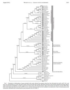
This cladogram was exported from PAUP as a pdf, and heavily edited in Illustrator to add support measures, terminal taxon states and taxonomic information
Given the choice of presenting either a cladogram (where all the branches end at the same distance from the edge of the page) or a phylogram (where the branch lengths are representative of how much sequence variation occurs along them) I always favour the latter, which provides more information about the underlying DNA sequences. However, branch annotations and character mapping on these can be difficult, given that most phylograms contain at least some very short branches. In such cases there is an argument for presenting both. It is also a mistake to try to squeeze too much information onto any one tree – taxonomy plus geography plus character reconstructions plus support values cannot all be easily summarized in the same diagram.
Once you know which figures you are going to require for your paper/ talk/ thesis – and making figures is a laborious job, so it really IS best to settle this beforehand rather than wasting time on figures that turn out to be surplus to requirements – then comes the time to convert that Nexus/Newick file into a stunning visual. The basic output of a programme like PAUP* or Mesquite is not generally publishable as is. In order to be useful, informative and attractive, trees require annotations. Scientifically, things like bootstraps and jackknives and posterior probability distributions need to be added on, in order that your reader/audience can tell which relationships in your study receive statistical support, and thus are most likely to be robust to the addition of further data. It is never worth spending large amounts of ink pontificating about unsupported relationships, as adding more accessions or sequences from other loci often alter unsupported branching patterns.
Depending on the size and complexity of your tree, support values can either be annotated on in their entirity (best for a smaller or straightforward tree), or using a simple graphic measure like altering branch thickness to reflect levels of support (more suitable for a large or complicated tree, where other information is also being mapped).
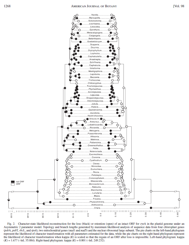
These phylograms represent two character mappings from Mesquite. Illustrator was used to reverse one tree, place both together, remove and replace taxon names and add a scale
But ‘How do I do it?’ is one of those awful questions with 100 equally valid answers. Many phylogenetics programmes will allow you to export a pdf directly, although it can be wise to instead import tree files that have been produced from phylogentic programmes like PAUP or GARLI into FigTree , a nifty (and free) bit of software that allows many visual manipulations (trees can be rerooted, lineages removed, branch order changed, font altered and various colouration schemes applied) followed by exporting of images in graphical formats like pdfs and jpgs.
Personally I tend to import my trees (as graphics) into Adobe Illustrator, which then allows addition of text and alterations of individual branch thicknesses and colours. One slight headache is that font does not export nicely– it tends to look pixelated – and in my published trees I have laboriously deleted and overwritten the exported font with the taxon names that I want to publish. This is not something that you want to do multiple times, but people do not always want to publish the exact names that they have used in their analyses anyway, and it is unwise to spend a lot of time preparing a figure in which you cannot go back and alter taxon names at a later date (like when the reviewer points out your embarrassing typo). If at that stage you have to go all the way back to PAUP, edit a name in a Nexus or Newick file, reexport the tree graphic, and redo all the annotations, you are not going to be very happy, while if all you have to do is alter text in an Illustrator text window, you are in a far better situation.
However, if there is one small repetitive thing that you need to alter right across your tree topology, editing it in the Newick file makes sense – for example a ‘search and replace’ on ‘F.’ for ‘Fossombronia’ if you have used abbreviated genus names that will neither be clear in the publication, nor be acceptable for TreeBase when you come to put your tree files into a public database.
As far as taxon names go, simplicity and clarity are key. If your entire phylogeny is of one genus, then abbreviating the genus name to an initial reduces text without compromising information content. If you have multiple genera, however, genus initials are frankly annoying. Long complicated accession codes are also irritating – if you routinely use something like an institutional DNA number (like ours, e.g. EDNA13-000137) I would at a bare minimum drop the ‘EDNA’ that will appear in each taxon name, and may drop the entire number too. However, each terminal in the tree MUST be able to be compared to the relevant information in your voucher table, so if you have two samples from the same taxon, these must be distinguished either by voucher information, by institutional accession, or by locality information that appears both in the name on the tree figure AND in the voucher table.
If you talk about lineages in the text, don’t expect your reader to work out what they are for themselves – annotate! There are a number of ways to do this, including bars down the side of the tree [insert example]or dropping coloured or shaded boxes underneath the tree (and here using some sort of colour gradation in the boxes can prevent the tree topology from getting confused). Microsoft Powerpoint is an easy and widely available software programme that allows this sort of annotation where more expensive options like Illustrator are not available.
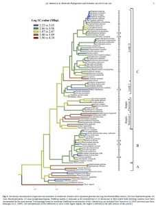
Character mapping on this phylogram was performed in Mesquite, then the image file was opened in Illustrator, all the taxon names and key information were removed and rewritten, and annotations were added down the right hand side of the tree
Colour is a powerful tool – tree branches can be coloured to reflect taxonomy. This can be an effective visual for picking out paraphyletic lineages that are scattered across the tree. Colour/shade is also appropriate for simple character mapping, particularly using parsimony. While it is easiest for either/or states, like gene presence or absence (where the reconstructions should also show up in grayscale, the way most people will print out copies of your paper), cold to warm colour gradations can also be used, for example, for small-to-large genome size characters. One of the simplest packages for character state reconstructions is Mesquite, and graphical files created in Mesquite can be exported and tidied up using Adobe Photoshop and Illustrator.
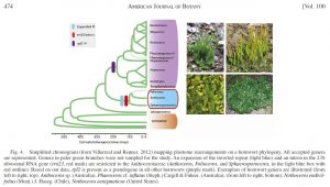
This backbone cladogram phylogeny was generated as a Nexus file, opened in FigTree, and the image then imported to Illustrator and Photoshop for manipulation
